
A fishbone diagram, also called an Ishikawa diagram or cause and effect diagram, is the most reliable visual tool manufacturing teams have for organizing the potential causes of a measurable problem before committing to a fix. Developed by quality engineer Kaoru Ishikawa, the diagram structures brainstorming around the 6Ms framework — Man/People, Machine, Method, Material, Measurement, and Mother Nature — giving quality managers a structured map of where defects, scrap spikes, or downtime events might originate. It does not tell you the answer. It tells you where to look.
The diagram is one of the seven basic quality tools recognized by the American Society for Quality, and it appears as a required artifact in ISO 9001 corrective action processes and Six Sigma DMAIC projects. In smaller investigations, it can stand alone as the primary analysis tool. In complex problems, it works alongside Pareto charts, 5 Whys, and control charts.
Key attributes of fishbone diagrams in manufacturing:
- They organize potential causes into categories, not conclusions.
- The fish head represents the measurable problem (the effect); the bones represent cause categories and sub-causes.
- They support team brainstorming by giving every participant a structured entry point.
- They generate hypotheses that must be validated with data before any corrective action is taken.
- They create documented evidence of structured root cause analysis, which auditors and quality standards require.
- They apply across industries, from automotive and electronics to food production and pharmaceuticals.
What the 6Ms actually cover on the shop floor
The 6Ms framework gives manufacturing teams a consistent starting point for categorizing potential causes. Each category targets a distinct area of the production system.
- Man/People: Human factors including training gaps, skill levels, fatigue, and communication breakdowns. Relabeling this category "People" rather than "Man" is a deliberate choice. It shifts the team's thinking toward systemic and environmental contributors rather than individual error, which produces more accurate root cause lists.
- Machine: Equipment condition, calibration status, tooling wear, and maintenance history. A machine running generally within specification can still be the source of intermittent defects if its maintenance schedule slips.
- Method: Procedures, work instructions, process sequences, and regulatory requirements. If the standard operating procedure allows variation in how an operator performs a step, that variation belongs here.
- Material: Raw materials, components, packaging, and consumables. Supplier changes, lot-to-lot variation, and storage conditions all fall under this bone.
- Measurement: Gauges, sensors, data collection points, and lab procedures. A measurement system that drifts or lacks calibration can make a stable process look unstable.
- Mother Nature (Environment): Temperature, humidity, vibration, dust, and shift-to-shift environmental variation. Food manufacturers in particular see this category drive significant defect patterns.
Kaoru Ishikawa stressed that customization is beneficial — the 6Ms are a starting framework, not a rigid checklist. A food production facility might add "Sanitation" or "Compliance" as standalone categories. A high-mix electronics shop might split "Machine" into "Equipment" and "Software" when automation is a major variable.

How to build and run a fishbone diagram session
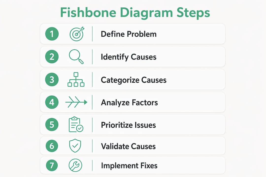
The best practice workflow runs in three phases: map causes, drill down, then validate with data. Skipping the third phase is where most teams waste their effort.
- Define the problem precisely. Write the measurable effect at the fish head. "High scrap rate" is too vague. A precisely quantified scrap rate during a defined shift or period gives the team something specific to investigate.
- Draw the diagram frame. A horizontal arrow points to the problem statement. Six diagonal branches extend from the spine, each labeled with one of the 6Ms.
- Brainstorm causes by category. Work through each bone with the full team. Ask "What in this category could cause the problem?" and record every idea without filtering.
- Add sub-causes. For each cause identified, ask "Why would this happen?" and branch off a smaller bone. Two or three levels of branching usually reveal the most specific causes.
- Apply the 5 Whys to the most likely branches. Once the diagram is populated, the team votes or uses process knowledge to identify the two or three most probable causes. Apply the 5 Whys technique to each to reach the root level.
- Collect data to test each hypothesis. Check sheets, control charts, and equipment logs are the tools here. A cause that looks obvious on the diagram may disappear when you pull the data.
- Design corrective actions for validated causes. Only after data confirms a cause should the team commit to a fix, whether that is a poka-yoke device, a revised work instruction, or a supplier change.
Pro Tip: Assign a neutral facilitator who is not directly responsible for the process under investigation. Teams with a stake in the outcome tend to populate the diagram with causes that are easy to fix rather than causes that are most likely. A neutral facilitator keeps the session honest.

What fishbone diagrams look like in practice
Two examples illustrate how the tool works at different levels of complexity.
Example 1: Scrap spike on a packaging line. A food manufacturer sees a sudden increase in seal failures on a pouch line. The team draws the diagram with the problem at the head and populates each bone. Under Machine, they note seal bar temperature variation and worn jaw inserts. Under Material, they flag a recent film supplier change. Under Method, they identify that the line speed was increased two weeks before the spike began. Under Measurement, they find that the seal strength test was only performed once per shift rather than hourly. The diagram does not tell them which cause is responsible. It tells them they have four hypotheses worth testing.
Example 2: Recurring iron contamination in a chemical product. The ASQ fishbone example shows a manufacturing team investigating periodic iron contamination in a product. Under Machine, sub-causes included exchangers, reactors, pumps, and pipes. Notably, "calibration" appeared under both Methods and Measurement, and "iron tools" appeared under both Methods and Man. This kind of overlap is normal and useful. It tells the team that certain causes cut across multiple system areas, which usually means they are higher-priority candidates for investigation.
The link from diagram to corrective design matters. When operator blaming is avoided and the team focuses on system design, fixes tend to be durable. A sensor interlock that prevents a machine from running with an out-of-spec parameter is more reliable than a reminder to operators to check the gauge.
- Causes that appear in multiple categories are often the highest-priority hypotheses.
- Sub-causes two or three levels deep are usually more actionable than top-level causes.
- Corrective actions tied to poka-yoke or design changes address root causes rather than symptoms.
- Validation data should be collected under the same conditions that produced the original defect.
Adaptations and best practices that actually improve results
Generic 6Ms categories work well as a starting point, but tailored categories improve relevance and team engagement, particularly in specialized facilities. A food manufacturer dealing with a contamination event will get more useful output from a diagram that includes "Sanitation" and "Allergen Control" than from one that lumps those concerns under "Environment."
Best practices for manufacturing fishbone sessions:
- Customize categories before the session starts. Review the problem type and the facility's known failure modes, then adjust the bones accordingly.
- Include operators in the room. Facilitated sessions that use inclusive communication capture operator insights that management often misses. Operators carry undocumented real-time knowledge about how a process actually behaves.
- Avoid blame language. Frame every cause as a system condition, not a person's failure. "Operator did not follow procedure" is a symptom. "Procedure is unclear at step 7" is a cause.
- Set a time limit for brainstorming. Sixty to ninety minutes is enough for most problems. Longer sessions produce diminishing returns and increase the risk of analysis paralysis.
- Update the diagram as new data arrives. A fishbone is a living document during an investigation, not a one-time output.
- Link every validated cause to a measurable corrective action. If the cause cannot be tied to a specific fix with an owner and a deadline, it is not ready to close.
Some practitioners add "Money" or "Management" as additional categories when investigating problems with a strong resource or organizational dimension. This is consistent with Ishikawa's original intent: the framework should serve the investigation, not constrain it.
How software makes fishbone analysis faster and more accurate
Digital manufacturing intelligence tools change what is possible in a fishbone session. Instead of relying on operator memory and paper logs, teams can pull real-time equipment data, shift reports, and downtime records directly into the analysis. Integrating software with fishbone workflows enables real-time issue detection and AI-enhanced analysis for faster root cause validation.
Gembalabs collects sensor data from equipment cycles alongside operator-entered notes on downtime, rework, and shift events. When a quality manager opens a fishbone session after a defect spike, the relevant data is already organized. AI-generated reports flag recurring patterns, which means the team spends less time arguing about what happened and more time identifying why.
Pro Tip: Before your next fishbone session, pull the last 30 days of equipment cycle data and downtime logs from your manufacturing software. Bring that summary into the room. Teams that start with real data rather than memory produce shorter, more accurate diagrams and reach validated root causes faster.
For teams tracking material shortages and supply chain inputs, connecting upstream supply data to the Material bone of the diagram can surface causes that would otherwise stay invisible until the next defect event.
Case studies: fishbone diagrams solving real manufacturing problems
Automotive seat assembly. A plant producing seat assemblies saw a recurring torque specification failure on a fastener. The fishbone session identified four candidate causes across Machine (torque wrench calibration drift), Method (no torque verification step in the work instruction), Material (fastener lot variation from a secondary supplier), and People (two operators trained on an older procedure version). Data collection confirmed that calibration drift and the outdated training were both active contributors. Fixing both reduced the failure rate to near zero within two production cycles.
Food packaging contamination. A mid-size food manufacturer experienced intermittent foreign material findings in finished product. The fishbone diagram, customized to include a Sanitation bone, pointed to a worn gasket in a filler head as the most likely Machine cause and an inconsistent sanitation verification step as the most likely Method cause. Both were confirmed with inspection data. The root cause analysis process documented in the corrective action record satisfied the facility's food safety audit requirements.
How to prioritize root causes after the diagram is complete
Not every bone on a fishbone diagram deserves equal attention. Prioritization keeps investigations from stalling.
Use a simple voting method first. Give each team member three to five votes and ask them to mark the causes they believe are most likely based on process knowledge. Causes that receive multiple votes from different team members are the strongest candidates for data collection.
Then apply a two-factor screen: likelihood and controllability. A cause that is highly likely but outside the facility's control (a supplier's raw material specification) needs a different response than a cause that is both likely and fully within the team's control (a calibration interval). Prioritize causes where the team can act directly and quickly.
Pareto analysis adds a quantitative layer. If you have defect data broken down by shift, machine, or operator, a Pareto chart will show which categories account for the largest share of the problem. Cross-referencing the Pareto output with the fishbone diagram narrows the field to the two or three causes most worth investigating.
How to validate hypotheses before committing to a fix
A fishbone diagram is a hypothesis generator, not a diagnosis. Teams that treat the diagram as a conclusion often waste resources solving causes that were never actually driving the problem.
Validation starts with targeted data collection. For each prioritized cause, define what data would confirm or rule it out, then collect it under controlled conditions. If the hypothesis is that seal bar temperature variation causes seal failures, run a controlled test at the upper and lower ends of the temperature range and measure seal strength at each level.
Control charts are useful here. If a cause is active, you should see a pattern in the data that corresponds to when the cause condition is present. A stable control chart during the test period is strong evidence that the hypothesized cause is not the driver.
Document every test and its result. ISO 9001 corrective action requirements and Six Sigma DMAIC methodology both expect evidence that root causes were confirmed before solutions were implemented. That documentation also protects the team if the problem recurs and a new investigation is needed.
Key Takeaways
The fishbone diagram is a hypothesis-generation tool that must be paired with data validation to drive durable corrective action in manufacturing.
| Point | Details |
|---|---|
| Start with a measurable problem | Write a specific, quantified problem statement at the fish head before brainstorming begins. |
| Use the 6Ms as a starting framework | Customize categories like adding Sanitation or Compliance to match your facility's actual failure modes. |
| Include operators in every session | Operators hold real-time process knowledge that management often misses; their input improves root cause accuracy. |
| Validate every hypothesis with data | A cause that looks obvious on the diagram may not hold up when you pull control chart or check sheet data. |
| Document the full process | Fishbone diagrams serve as corrective action evidence required by ISO 9001 and Six Sigma audits. |
See how Gembalabs supports your root cause investigations
Gembalabs gives food manufacturers a direct line from equipment sensor data and operator shift notes to the kind of structured analysis a fishbone session needs. Instead of reconstructing what happened from memory, your team walks into the session with AI-generated reports covering downtime patterns, rework frequency, and recurring equipment events already organized by category.
If you want to see what that looks like for your facility, explore how it works or visit Gembalabs to learn more about the platform.