Yield loss analysis is the practice of turning raw production counts (units started, good units, scrap, rework, downtime) into a ranked list of the specific problems costing you the most money, so you can fix the biggest ones first. It matters because a plant running with first-pass yield well below optimal levels isn't losing a rounding error. It's losing capacity you already paid for in labor, ingredients, and machine time.
If you're starting today, do three things before the shift ends:
- Pull last week's scrap and rework tags and sort them by reason code, even a rough one. You need a first pass at "what's breaking," not a perfect taxonomy.
- Calculate first-pass yield (FPY) for your worst-performing line using good units divided by units started. One number, one line, right now.
- Assign one owner to review that data within 48 hours and flag the top two loss reasons for a root-cause conversation this week.
Do this consistently and within a month you'll have visibility into where hours and dollars are actually leaking, not where you assume they are. Most plants find their real top loss driver isn't the one operators complain about most.
Key Takeaways
Yield loss analysis works when raw counts and event data get converted into a ranked, cost-weighted list of causes that teams fix in priority order, then verify.
| Point | Details |
|---|---|
| First 30 days | Calculate FPY and scrap rate on your worst line, build a reason-code taxonomy, and log every scrap and rework event with a code attached. |
| Next few months | Run your first Pareto chart, complete root cause analysis on the top two contributors, and implement at least one containment fix. |
| By 180 days | Verify fixes moved the metric, formalize a control plan with alarm thresholds, and expand the taxonomy to a second line. |
| Track these metrics throughout | Monitor FPY, scrap rate, rework rate, and cost of loss weekly, and confirm the Pareto ranking is stable, not shifting due to taxonomy drift. |
| Combine sensor and operator data | Gembalabs pairs real-time equipment monitoring with operator notes and AI-generated reports to speed up this exact workflow for food manufacturers. |
Table of Contents
- What Is Yield Loss Analysis and Which Metrics Matter?
- What Data Do You Need to Run Yield Loss Analysis?
- What Is the Step-by-Step Yield Loss Analysis Workflow?
- Which Technologies Actually Support Yield Loss Analysis?
- What Are the Most Common Root Causes of Yield Loss?
- What Countermeasures and Controls Actually Sustain Yield Gains?
- How Do You Set Realistic Yield Benchmarks?
- How Do You Calculate Yield Loss From Real Production Data?
- Why Combine Sensor Data With Operator Notes for Yield Loss Analysis?
- How Do You Run a First Yield Loss Analysis Pilot?
- What Actually Separates a Working Yield Program From a Stalled One
- How Gembalabs Turns Sensor and Operator Data Into Faster Yield Fixes
- Frequently Asked Questions
- Sources
What Is Yield Loss Analysis and Which Metrics Matter?
Yield loss is the gap between what a process could theoretically produce and what it actually produces as good, sellable output. Yield loss analysis is the structured process of measuring that gap, breaking it into causes, and directing fixes at the causes with the biggest financial impact. It sits at the intersection of quality management, cost accounting, and floor operations, and it only works when you're tracking the right metrics consistently.
Here's the core vocabulary, because these terms get used loosely on most factory floors and that looseness costs money.
First-pass yield (FPY) measures the percentage of units that come out right the first time, with no rework, no scrap, no rejects. Formula: FPY = Good Units ÷ Units Started × 100. Use it at the individual process-step level, like a filling station or a wrapping line.
Rolled throughput yield (RTY) multiplies the FPY of every sequential step in a multi-stage process together. A multi-step line running high FPY at each stage does not deliver that same yield overall because losses compound. RTY is the metric that exposes that compounding effect, and it's the one most plants skip because it requires stage-by-stage data most legacy systems don't capture cleanly.
Scrap rate is the percentage of units started that are discarded entirely: Scrap Units ÷ Units Started × 100.
Rework rate is the percentage that require additional labor or processing to become sellable: Rework Units ÷ Units Started × 100. Rework is sneakier than scrap because it often hides in labor budgets instead of showing up as a material write-off.
OEE (Overall Equipment Effectiveness) multiplies Availability × Performance × Quality to show how efficiently an asset runs against its theoretical maximum. Yield loss analysis and OEE overlap heavily. OEE tells you an asset is underperforming; yield loss analysis tells you why, in terms of specific reasons and costs. If you want the full breakdown of how OEE relates to capacity planning, the comparison in OEE vs TEEP is worth a read.
Cost of loss converts scrap, rework hours, and downtime into a dollar figure using loaded labor rates, material costs, and overhead. Lost-time-to-cost models typically apply an hourly rate plus overhead multipliers and recovery assumptions to translate minutes of loss into a monthly or annual budget line, which is often the single most persuasive number you can bring to a plant manager meeting, according to a lost time cost calculator breakdown of the method.
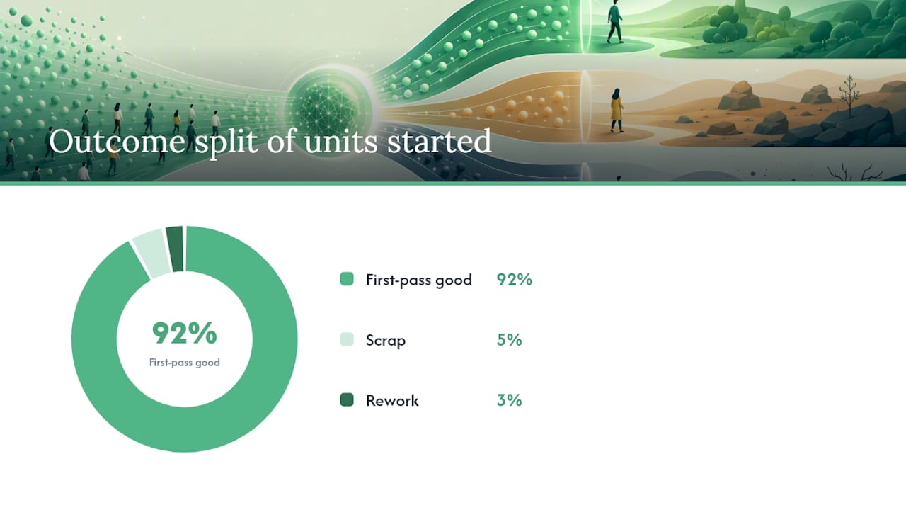
A worked example: A line starts 10,000 units. 9,200 come out good on the first pass. 500 are scrapped. 300 require rework at an average of 6 minutes of extra labor each.
- FPY = 9,200 ÷ 10,000 = 92%
- Scrap rate = 500 ÷ 10,000 = 5%
- Rework rate = 300 ÷ 10,000 = 3%
- Rework hours = 300 × 6 minutes = 1,800 minutes = 30 hours of added labor
At a loaded labor rate of roughly $28/hour, that rework alone costs hundreds of dollars for this single run, before you even count the scrap material cost.
Pro Tip: FPY looks great on a single step and terrible once you roll it up across a five-stage line. Always calculate both. A manager who only reports stage-level FPY can hide a serious multi-step yield problem for months.
The common measurement trap: teams calculate FPY inconsistently, sometimes counting rework as "good" if it eventually passes. That inflates the number and hides real cost. Decide your definition once, document it, and never let it drift between shifts or plants. Academic work on production yield analysis00067-5) makes a similar point in food processing specifically: separating expected mass loss (trimming, moisture loss) from unwanted process loss is essential, or you'll chase phantom problems that are actually just physics.
What Data Do You Need to Run Yield Loss Analysis?
Reliable yield loss analysis depends less on sophisticated software and more on disciplined, consistent data capture. Most plants already generate the raw data. It just lives in five different places and none of them talk to each other.
Here's the minimum data checklist:
- Counts in/out at every measurement point: units started, good units, scrap, rework.
- Scrap and rework tags with a reason code attached at the moment of the event, not reconstructed later from memory.
- Run-time versus ideal-time for each asset, so you can separate speed loss from availability loss from quality loss.
- Event logs timestamped to the minute, covering stops, changeovers, jams, and quality holds.
- Operator notes capturing context a sensor can't, like "supplier changed packaging film mid-shift."
- Batch and lot identifiers so a yield problem can be traced back to a specific raw material lot or supplier.
- Material lot numbers linked to incoming quality data, so a scrap spike can be cross-referenced against a specific ingredient delivery.
The taxonomy question matters more than most teams realize. If one operator logs a stoppage as "jam" and another logs the identical event as "mechanical," your Pareto chart splits one real problem into two smaller, less visible ones. Define your loss categories and reason codes before you build any dashboard. A standard work approach to documenting operator procedures helps keep that taxonomy consistent shift over shift, which is the difference between a Pareto chart that tells the truth and one that just reflects whoever was on shift when the labeling happened.
Collection methods range from manual paper logs and daily production reports to fully automated MES event capture and PLC/sensor data feeds. Most food manufacturers land somewhere in the middle: sensors capture machine-state data automatically, operators log the "why" behind quality events manually. A well-structured daily production report process is often the fastest way to get consistent operator-side data without buying anything new.
Pro Tip: The single biggest collection mistake is asking operators to choose from 40 reason codes on a dropdown menu mid-shift. They'll pick whatever's closest to the top of the list just to keep moving. Cap your reason code list at 10 to 12 categories per line, and let a supervisor refine detail during shift review instead of forcing precision in the moment.
ERP systems like SAP PP can technically record "reason for variance" data, but out-of-the-box confirmation screens are often too limited to capture the granularity yield loss analysis needs, and SAP Community discussions on the topic routinely recommend custom fields or supplementary activity recording to close that gap.
What Is the Step-by-Step Yield Loss Analysis Workflow?
Yield loss analysis follows a repeatable sequence: collect, validate, rank, diagnose, fix, verify. Skipping steps, especially validation and verification, is why so many improvement projects stall after an initial win.
- Collect data across the full period you're analyzing, typically one to four weeks minimum for a stable Pareto. Owner: shift supervisors and MES/data systems. Output: a clean event log with reason codes, quantities, and timestamps.
- Validate the data by checking for missing timestamps, duplicate entries, and reason codes that don't map to your taxonomy. Owner: the data owner or continuous improvement lead. Output: a cleaned dataset ready for aggregation.
- Build the Pareto chart by summing loss hours or loss cost by reason code and sorting descending. Loss reason Pareto charts typically show incident count, loss hours, and average loss per event in the same view, which matters because a reason with few incidents but a huge average loss per event deserves different treatment than one with many small incidents, according to Pareto chart documentation from performance management tooling. Owner: continuous improvement lead. Output: ranked loss reasons, with the top 20% of causes usually responsible for the majority of loss hours.
- Run root cause analysis on the top two or three contributors using 5 Whys for straightforward mechanical issues, a fishbone diagram for multi-factor problems, and FMEA when the failure mode carries safety or regulatory risk. Escalate to engineering when the root cause touches equipment design or process parameters outside operator control. Owner: RCA team including a supervisor, a maintenance technician, and often a quality representative. Output: a documented root cause with supporting evidence.
- Select and implement countermeasures, choosing between quick containment and a permanent fix based on urgency and root cause certainty. Owner: process engineer or plant manager. Output: an assigned corrective action with a deadline.
- Verify the fix by rerunning the Pareto after a defined period and confirming the target loss reason has dropped. Owner: continuous improvement lead. Output: a before/after comparison proving the fix worked, not just a note that says it "should be better now."
When choosing your Pareto window, be careful about seasonality and product mix changes. A one-week window during a single-SKU run will look nothing like a month that includes three product changeovers. Match the window to a period that reflects your normal operating mix, or you'll optimize for a scenario that doesn't recur.
Detailed guidance on running the RCA step itself, including how to structure a 5 Whys session so it doesn't stall on the first plausible answer, is covered in this root cause analysis guide, and the fishbone diagram method is particularly useful when a loss reason has more than one plausible contributing factor.
Which Technologies Actually Support Yield Loss Analysis?
The right technology stack for yield loss analysis depends on how much manual reconciliation you're willing to tolerate, not on buying the most expensive system available. A spreadsheet with disciplined operator input can outperform an expensive MES with sloppy taxonomy.
That said, here's what a capable system should offer:
- Real-time event capture at the machine level, so downtime and quality events are timestamped automatically rather than reconstructed from memory at shift-end.
- A structured loss-reason taxonomy built into the data entry interface, not left to free text.
- Operator input fields that capture context sensors can't, ideally in under 15 seconds per entry.
- Batch traceability linking every unit produced back to a specific lot, shift, and material source.
- Timestamp accuracy synced across every data source, since a five-minute clock drift between a PLC and an operator tablet can misattribute a loss event to the wrong root cause entirely.
- Integration with ERP/MES so financial reporting and floor-level loss data tell the same story instead of two conflicting ones.
The integration point that trips up most implementations is timestamp and identifier syncing between sensor feeds and operator notes. If a sensor logs a stoppage at 14:32 and an operator logs the corresponding note at 14:41 under a slightly different batch ID, your analysis tool either merges them wrong or drops the context entirely. Test this sync during any pilot before trusting the combined data for RCA. Equipment performance monitoring practices built around consistent logging standards solve most of this before it becomes a data problem.
Analytics and BI layered on top of clean event data speed root cause discovery considerably. Diagnosis-driven approaches that aggregate data across lines or shifts can uncover systematic issues invisible in a single failure report, and industry reporting on yield analysis in high-volume manufacturing has found this kind of aggregation shortens failure-analysis cycles specifically because it surfaces patterns no single operator would ever notice from their own shift alone.
A real-world example: one packaging line had a recurring scrap spike every Tuesday that nobody could explain from operator logs alone. Cross-referencing sensor vibration data with shift schedules revealed the spike coincided with a specific relief operator's changeover technique on one machine, a pattern invisible until sensor timestamps and operator shift data were viewed together. That's the value sensor-plus-operator data adds: it catches correlations a single data source misses.
Pro Tip: Before evaluating any monitoring platform, ask for a live demo using YOUR loss reason taxonomy, not the vendor's default categories. If the system fights your naming conventions instead of adapting to them, it'll create more reconciliation work than it saves.
For a broader look at feature sets across line-monitoring options, see this line monitoring software guide.
What Are the Most Common Root Causes of Yield Loss?
Nearly every yield loss traces back to one of five categories: material, machine, method, manpower, or measurement. Recognizing the pattern quickly is half the battle in root cause analysis.
Material issues show up as raw ingredient variability, packaging film inconsistency, or supplier lot-to-lot differences. A bakery line that suddenly sees a rise in torn packaging almost always traces to a film thickness change from the supplier, not an equipment fault. Evidence to collect: material certificates of analysis, supplier lot numbers, and side-by-side samples from the affected and unaffected lots.
Machine causes include tool wear, calibration drift, and worn seals or gaskets. Evidence to collect: time-series sensor traces showing gradual drift versus sudden failure, plus maintenance history on the specific component.
Method failures usually come from setup errors, inconsistent changeover procedures, or a process parameter set outside its validated range. A line that runs fine on the day shift and poorly on nights often has a method problem, not a people problem, specifically an undocumented setup step that only the day-shift lead remembers to do. Evidence to collect: setup checklists compared across shifts, and process parameter logs during changeover windows.
Manpower causes involve training gaps, fatigue-related error rates late in a shift, or inconsistent adherence to standard work. This is the category most prone to blame without evidence, so document specific practices rather than assuming a person is "the problem." Evidence to collect: comparison of defect rates by shift and by operator tenure, cross-referenced against training records.
Measurement causes are the most overlooked: inspection equipment out of calibration, inconsistent sampling plans, or subjective visual inspection criteria that vary operator to operator. A scrap rate that looks high might partly be a measurement problem if two inspectors interpret the same defect threshold differently. Evidence to collect: gauge repeatability and reproducibility (Gauge R&R) data, and side-by-side inspection comparisons.
In a typical Pareto, material and machine causes cluster at the top for lines with high SKU variety or aging equipment, while method and manpower causes dominate on newer lines with frequent changeovers. Measurement issues rarely top the Pareto by cost, but they quietly distort every other category's numbers if left unaddressed, which is why they deserve a periodic audit even when they're not the biggest line item.
What Countermeasures and Controls Actually Sustain Yield Gains?
Every yield loss fix falls into one of two buckets: containment, which stops the bleeding now, or a permanent corrective action, which addresses the root cause so the problem doesn't return. Confusing the two is how "temporary" fixes quietly become permanent workarounds that nobody remembers to revisit.
Containment makes sense when you need an immediate stop to a quality escape, when the root cause isn't confirmed yet, or when a permanent fix requires capital or engineering time you don't have this week. Permanent fixes make sense once the root cause is verified and the cost of the ongoing loss justifies the investment to eliminate it.
| Loss Category | Typical Containment Action | Typical Permanent Fix |
|---|---|---|
| Material variation | Increase incoming inspection sampling rate | Qualify a second supplier or tighten incoming spec |
| Machine drift | Increase calibration check frequency | Install automated in-line calibration verification |
| Setup/method error | Add a supervisor sign-off before line restart | Build a poka-yoke that physically prevents wrong setup |
| Manpower/training | Pair inexperienced operators with a mentor | Redesign the standard work instruction with visual aids |
| Measurement inconsistency | Standardize inspection criteria with reference photos | Automate the inspection step with vision systems |
Estimating payback is straightforward once you've converted lost hours to cost. If a fix costs $8,000 to implement and eliminates a loss reason costing $1,200 per week, payback lands under seven weeks, a calculation efficiency-loss cost models handle by layering in overtime and rework drag on top of the direct hourly cost to get a more realistic adjusted figure.
A control plan template should specify: monitoring frequency (daily, weekly, per-batch), a named owner responsible for the metric, an alarm threshold that triggers investigation, and a clear escalation path when the threshold is breached twice in a row. Without this, even a well-executed fix drifts back toward baseline within a few months because nobody's watching for the regression.
How Do You Set Realistic Yield Benchmarks?
Realistic yield benchmarks come from your own best historical performance, not from nameplate capacity or an industry average pulled from a trade publication. Nameplate capacity assumes zero changeovers, zero material variability, and a machine running exactly as the manufacturer specified in a lab, which no real production floor ever matches.
Build your internal benchmark by identifying your best sustained run, not your single best hour, over the past six to twelve months. That becomes your "should-be" target. Asset Utilization methodology, calculated as actual production divided by ideal production, is one practical way to formalize this: it forces you to define an honest ideal rate rather than an aspirational one, and case examples in that approach consistently point to complete loss accounting and management follow-through as the deciding factors in whether the benchmark actually drives improvement or just sits in a report nobody reads.
Once you have a benchmark, prioritize fixes using a simple two-axis view: impact (hours or dollars lost) against fixability (effort and time required). High-impact, easy fixes go first, always. High-impact, hard fixes get scheduled with a real project plan and budget. Low-impact issues, even numerous small recurring ones, deserve a batch review quarterly rather than one-off firefighting, because addressing them individually burns more improvement-team time than the losses themselves cost.
As a rough frame for process maturity, plants early in their yield improvement journey often run FPY in the 75% to 85% range with scrap rates above 5%. Where your line sits matters less than the direction and pace of movement quarter over quarter.
Small recurring losses deserve a different reporting cadence than one-time catastrophic events. A single major breakdown gets an incident report and immediate RCA.
When reporting progress to stakeholders, lead with the dollar figure, not the percentage. A plant manager remembers "$14,000 a month" far longer than "a 1.8 percentage point improvement in FPY," even though they describe the same result.
How Do You Calculate Yield Loss From Real Production Data?
Here's a full worked example using sample data from a single production run, showing exactly how raw counts become a prioritized action list.
| Metric | Value |
|---|---|
| Units started | 12,000 |
| Good units (first pass) | 10,320 |
| Scrap units | 900 |
| Rework units | 780 |
| Rework labor hours | 65 |
| Unplanned downtime hours | 4.5 |
Working through the numbers:
- Calculate FPY. FPY = 10,320 ÷ 12,000 = 86%. That's a 14-point gap from theoretical maximum, which on a 12,000-unit run is meaningful.
- Calculate scrap rate. Scrap rate = 900 ÷ 12,000 = 7.5%.
- Calculate rework rate. Rework rate = 780 ÷ 12,000 = 6.5%.
- Calculate cost of loss. At a material cost of $2.10 per unit, scrap alone costs 900 × $2.10 = $1,890. Rework labor at a loaded rate of $30/hour costs 65 × $30 = $1,950. Downtime at an estimated opportunity cost of $180 per hour (lost throughput value) adds 4.5 × $180 = $810. Total cost of loss for this single run: $4,650.
- Build the Pareto. Suppose the 900 scrap units break down as: 480 from a single supplier's film defect, 240 from a filler calibration drift, 180 from operator setup error on changeover. The film defect alone accounts for 53% of scrap units, making it the clear first target.
- Select the top fix. The film defect traces to a specific supplier lot, so the containment action is an immediate 100% incoming inspection on that supplier's next three shipments while procurement investigates a spec tightening with the vendor.
Why Combine Sensor Data With Operator Notes for Yield Loss Analysis?
Sensor data alone tells you a machine stopped. Operator notes tell you why. Yield loss analysis gets dramatically more accurate when both feed the same event log, because neither source alone captures the full picture.
The practical benefits are specific: sensors provide timestamp fidelity down to the second, which manual logs almost never achieve; they detect patterns across shifts that no individual operator would notice, like a stoppage that always happens 47 minutes into a specific product run; and they can automatically trigger an RCA workflow the moment a threshold is crossed, rather than waiting for someone to notice at shift-end review.
A pilot combining sensor feeds with operator notes should follow this checklist:
- Confirm timestamp sync between the sensor system and whatever operators use to log notes, tablet, terminal, or paper later transcribed.
- Validate identifier alignment, meaning a sensor-logged stoppage and an operator-logged note about the same event share a common batch or work-order ID.
- Run a two-week overlap period where both manual and automated logging happen in parallel, so you can catch discrepancies before trusting the combined feed exclusively.
- Review false positives weekly during the pilot, since new sensor thresholds tend to over-trigger initially until you tune them to real operating variance.
Expect noise early on. A newly instrumented line often generates alerts for micro-stops that were always happening but never got recorded before. That's not a system failure. It's the system finally seeing what was already there. Most well-run pilots produce a usable, actionable Pareto chart within four to six weeks, once initial calibration noise settles and enough incidents accumulate for the ranking to stabilize.
Pro Tip: Don't panic when your first sensor-driven Pareto chart looks worse than your old manual reports. It usually means you're finally seeing losses that were always there but never got logged, not that the line suddenly got worse.
For more on how real-time equipment monitoring integrates with operator workflows on food production lines specifically, the practical examples there mirror what most small and mid-size plants encounter during their first sensor rollout.
How Do You Run a First Yield Loss Analysis Pilot?
Scaling yield loss analysis beyond a spreadsheet exercise requires a defined pilot with real milestones, not an open-ended "let's start tracking things" initiative that fizzles by month two.
- Week 0: Setup. Define your loss taxonomy, pick one line or one product family as the pilot scope, and confirm data sources, whether that's a manual log, existing MES events, or new sensor feeds. Assign a data owner responsible for daily data quality checks.
- Weeks 1 through 4: Data collection. Run normal production while collecting clean, consistent data. Resist the urge to start fixing things yet, premature fixes during the baseline period corrupt your Pareto and make before/after comparisons meaningless.
- Weeks 5 through 8: Analysis and fixes. Build the Pareto, run RCA on the top two or three contributors, implement containment or permanent fixes, and begin tracking the verification metric for each fix.
Roles matter as much as the timeline. The production lead owns day-to-day data quality and operator compliance with the logging process. The engineer owns root cause investigation for machine and method issues. The data owner (sometimes the same person as the CI lead) owns Pareto construction, data validation, and reporting. The continuous improvement owner owns prioritization decisions and stakeholder communication.
The three pitfalls that kill most pilots: taxonomy drift, where reason codes get redefined mid-pilot and corrupt your Pareto comparability; poor timestamp sync, where sensor and operator data can't be reliably merged, undermining root cause confidence; and insufficient sample size, where a two-day pilot gets treated as statistically meaningful when it's really just noise. Consultants who specialize in implementation consistently flag inconsistent taxonomy as the top barrier, and it's almost always solvable by defining failure modes and a unified operator logging process before instrumenting any dashboard, not after.
What Actually Separates a Working Yield Program From a Stalled One
The plants that get yield loss analysis right don't have better software. They have a supervisor who checks the reason codes every single day for the first month and corrects sloppy entries on the spot. That's the pattern across every successful rollout worth studying: someone treats data quality as a daily discipline, not a monthly cleanup task.
The plants that stall almost always share the opposite problem. They buy a system, train operators once, and assume the taxonomy will hold itself together. It never does. Within six weeks, three different people are logging the same failure mode under three different names, and the Pareto chart that's supposed to drive decisions becomes a chart nobody trusts.
Operator engagement matters more than most improvement plans give it credit for. If the person entering data doesn't understand why a specific reason code matters, they'll pick the fastest option on the screen, not the accurate one. The fix isn't more training slides. It's showing operators, specifically, how their data led to a fix that made their own shift easier, whether that's a machine that stopped jamming or a changeover that got fifteen minutes shorter. That feedback loop, more than any dashboard, is what makes people log accurately without being told to.
One caution worth stating plainly: recovered hours can lie to you. A team that closes a capacity gap through overtime or compressed breaks looks successful on a weekly report, but that recovery often masks a deeper inefficiency that's still there, just hidden behind premium labor cost and higher error rates from fatigue. Chasing the recovered-hours number without asking whether the underlying cause got fixed is one of the most common ways plants convince themselves they've solved a problem they've actually just papered over. Financial accounting reports can compound this, since standard costing frequently buries "normal" losses inside the cost structure instead of exposing them, which is exactly why floor-level tolerance tracking and zero-defect counts matter more than the monthly P&L for catching what's really happening.
How Gembalabs Turns Sensor and Operator Data Into Faster Yield Fixes
Most of the analysis work described above depends on getting equipment data and operator context into the same system without weeks of manual reconciliation. That's the specific gap Gembalabs is built to close for small and mid-size food manufacturers: real-time equipment monitoring paired with lightweight operator input, combined into AI-generated production intelligence reports that summarize downtime, rework, and recurring loss patterns without someone spending a Friday afternoon building a Pareto chart by hand.

A pilot on one or two lines typically shows measurable Pareto insight within four to eight weeks, enough time to establish a clean baseline, surface your top two or three loss drivers, and see whether a targeted fix moves the needle before committing to a plant-wide rollout. Operator notes get captured in English or Spanish directly on the floor, so language isn't a barrier to consistent data entry, and reports get generated around the specific loss categories you care about rather than a generic template. If you're ready to see what your own equipment and shift data would reveal, request a pilot walkthrough and bring one line's worth of recent production numbers to the first conversation.
Frequently Asked Questions
What's the difference between yield loss and scrap? Scrap is one specific cause of yield loss, referring to units discarded entirely. Yield loss is the broader gap between theoretical and actual good output, and includes scrap, rework, and any output that falls short of full first-pass quality.
How often should you run a yield loss Pareto analysis? Weekly for active improvement projects, monthly for stable, mature lines being monitored for drift. A Pareto built on too short a window, like a single day, usually reflects noise rather than a real pattern.
Can small manufacturers do yield loss analysis without expensive software? Yes. A disciplined spreadsheet with consistent reason codes and daily data entry outperforms an expensive system with sloppy taxonomy. Software becomes valuable once manual reconciliation starts consuming more time than the insights are worth.
What's a good first-pass yield target for a food manufacturing line?
How do you convince management to invest in fixing a yield loss problem? Lead with the dollar figure, not the percentage. Converting lost hours into a monthly cost line using a loaded labor rate and material cost is consistently more persuasive than reporting a percentage-point change in a yield metric.
Does rework count as a yield loss even if the product eventually ships? Yes. Rework consumes extra labor, time, and sometimes materials that a first-pass success wouldn't require. Counting reworked units as equivalent to first-pass good units in your FPY calculation hides real cost and should be avoided.